Cross-Functional Data Literacy Programs That Have Worked
Mature programs ground data training in real problems and shared teams, not one-off workshops.

Data literacy programs keep failing for the same reason diets keep failing. Everyone treats the plan as the hard part, when the hard part is what happens after you close the binder and go back to your normal kitchen. Global data creation is on track to hit 181 zettabytes in 2025. That number is almost meaningless to a human brain, which is sort of the point: the workforce trying to make sense of that flood is not growing anywhere near as fast. The gap between how much data exists and how many people can actually use it is widening. It's the mismatch between supply and comprehension that's the real story here, and training alone hasn't closed it.
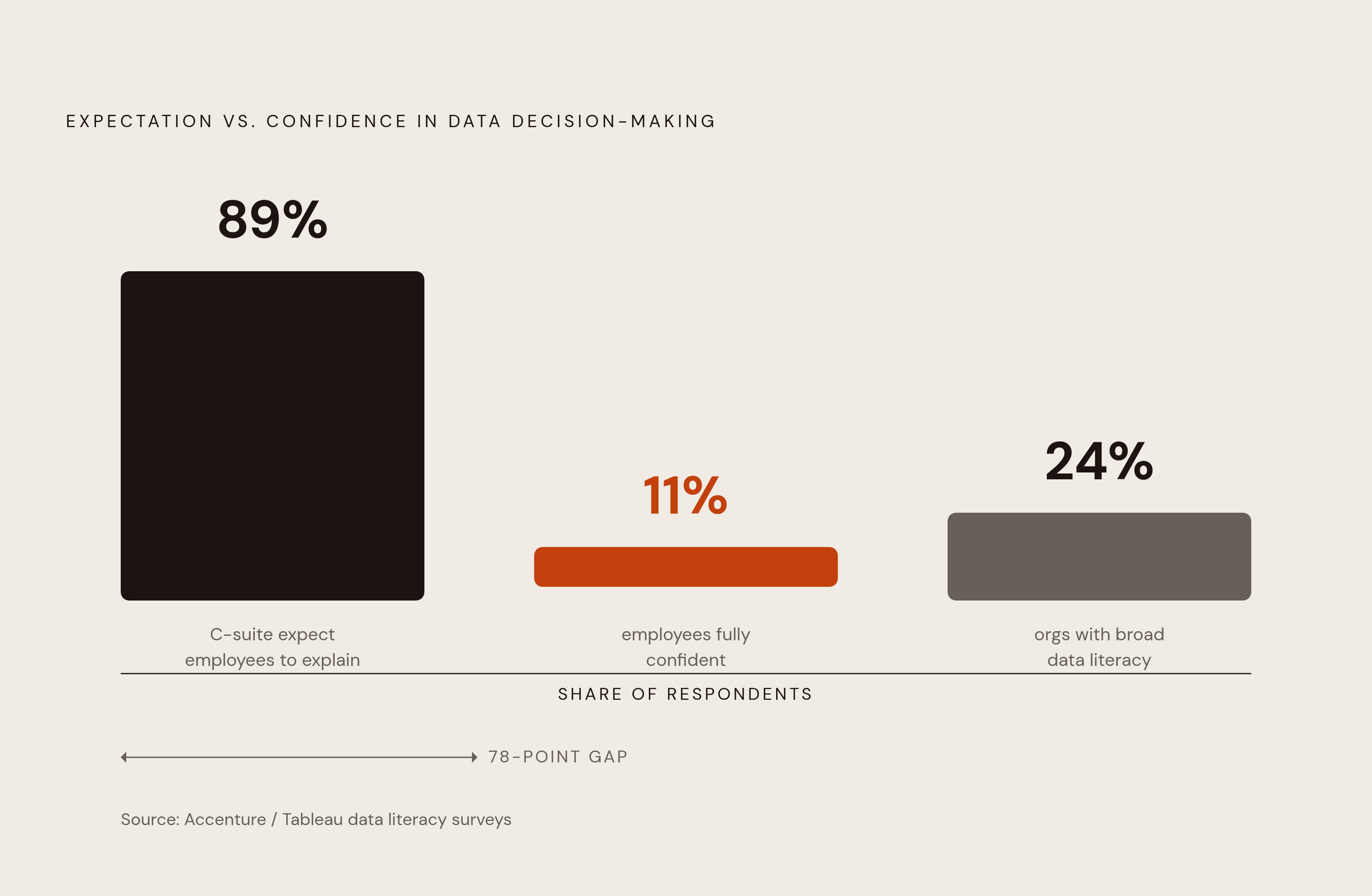
Qlik's global survey put a number on the anxiety: 89% of C-level executives expect employees to explain how data shaped a decision. Only 11% of employees say they're fully confident they could do that. Alation's State of Data Culture Maturity Report found fewer than a quarter of organizations have reached broad data literacy adoption, and roughly the same share have mature governance in place. So the demand for data fluency has outpaced the supply of it, badly, and most companies know it.
Leadership treats this as a content problem. Buy the training, run the workshop, check the box. Literacy is something you build over time through repeated use, not something you pour into people once and expect to stick. It's infrastructure, closer to plumbing than to a lecture. Giving people the access, the shared vocabulary, and workflows that put data in front of them at the exact moment they need it makes literacy take care of itself. Without that, the fanciest training curriculum in the world is just a nice PDF nobody opens again.
What the evidence shows about whether training moves the needle
Start with the good news, because there is some. AIR's National Survey found that institutions offering data literacy training rate their employees' capability at nearly double the level of institutions that don't train. That's not a marginal bump. Training works, when it's actually happening.
And more of it is happening. The share of institutions offering data literacy training grew from under a third in 2018 to almost 60% in 2024. That's real progress in six years, not nothing.
But even at institutions running training programs, plenty of leaders still describe their organization's data literacy as "Not Occurring" or "Reactive."" Training exists. It's just not landing. Why would that be, if training clearly correlates with higher capability elsewhere?
The likely answer is timing and relevance. A workshop that happens once a year, disconnected from the actual moment someone needs to make a decision, teaches a skill nobody gets to practice. It's the difference between a fire drill and knowing where the exit is when the room is actually filling with smoke.
This is where the ROI conversation sharpens. DataCamp and YouGov research found organizations with a mature, company-wide upskilling program are far more likely to report meaningful ROI from the technology, 42% versus a noticeably lower baseline for organizations without one. Yet only 35% of organizations have that kind of mature program in place. The upside is documented. The adoption still isn't there. That gap is the whole article in miniature.
The structural barriers that outlast any training program
Roughly a quarter of leaders (24%) cite a lack of executive support as a key barrier to company-wide adoption. Without a leader visibly backing the effort, a literacy program has the shelf life of a resolution made at the start of a year: strong for the first cohort, quietly abandoned by the second quarter.
Consistency is the other structural weak point. A single workshop doesn't shift how an organization behaves. Norms change through repetition, shared language, and leadership that keeps reinforcing it. Skipping any of those three lets turnover plus the next fire drill erase whatever ground got made.
Small data teams and institutional research offices are stuck in what amounts to a capacity trap. They're already handling compliance requests, recurring reports, one-off asks from every department, and tool maintenance. Asking that same team to also design and run a full literacy program is asking them to build a second job out of thin air. Bandwidth, not willingness, is usually the constraint.
And then there's vocabulary. When "active user," "churn," or "revenue" mean five different things across five different dashboards, meetings stop being about decisions and start being about which number is even correct. Vocabulary fragmentation is a structural failure. It's a structural failure that eats the exact time a literacy program was supposed to free up.
What cross-functional program design looks like when it works
The programs that hold up share a structural feature: they train groups, not individuals. AIR's Data Leadership Institute (DLI) brings together up to 30 people pulled from different roles and units, not a stack of solo learners working through the same content in isolation. That's a deliberate design choice. Shared mindset, shared vocabulary, and shared relationships only form when the people who'll use them are in the room together.
DLI runs on a 12-week cycle built around real practice: framing a question, gathering evidence, using it, and closing the loop. That cycle is tied to actual institutional decision-making, not an abstract curriculum sitting off to the side of the job. Participants work on real problems and finish with a capstone project. The skill sticks because the context is genuine. Nobody forgets how to use a skill they had to use to solve an actual problem they were already stuck on.
The strongest programs back this up by measuring applied outcomes rather than completion rates or attendance, tracking whether people actually developed new ideas or improved processes after finishing the training. That's the design choice that separates a program people remember from one they forget by Friday.
How culture changes: the role of leaders, vocabulary, and visible behavior
Institutions where leaders visibly model and reinforce data use see significantly higher employee use of information overall. Training builds the skill. Culture decides whether anyone bothers to use it. One without the other is a car with no gas, or gas with no car, take your pick.
Jordan Morrow's argument cuts right to the mechanism. Without a clear organizational strategy, employees are left guessing what's actually expected of them, and ambiguity sends people straight back to old habits. That's not a character flaw. It's just how humans behave under uncertainty. But when a leader asks for the data behind a decision, cites evidence in a meeting, and publicly credits a data-backed call, that signal is unmistakable. People notice what gets rewarded far faster than they absorb what gets taught.
The most durable version of this embeds learning directly into daily workflows, mentorships, and the design of the data products themselves. Put the explanation where people already look for the data, not in a separate portal they have to remember exists.
There's a broader signal validating all of this: the World Economic Forum's Future of Jobs Report found analytical thinking is the single most in-demand core skill among employers, with seven out of ten companies calling it essential. That's no longer a specialist skill reserved for the analytics team. It's a baseline expectation, and culture is the mechanism that either reinforces it every day or lets it quietly slide.
Self-serve data access as the infrastructure layer literacy programs require
Here's the bottleneck hiding behind most of this: data teams spend a large chunk of their time answering the same repetitive requests. Sales reports. Customer acquisition numbers. Inventory levels. Every hour spent pulling a report that could've been self-served is an hour not spent on the strategic work that actually needed a trained analyst. Self-serve access fixes this at the structural level. It's not a culture fix. It's a plumbing fix.
Think about what a non-technical person actually needs day to day. A finance manager checking a budget variance. A product manager checking feature adoption. A customer success rep watching a retention number move. None of them should have to file a ticket or write SQL to get an answer to a question that specific. The infrastructure has to meet them where they already are, not require them to learn a new location.
But self-service creates its own tension, one Gartner has a name for: governed self-service. Full autonomy without any oversight leads to a familiar mess, hundreds of ungoverned reports with conflicting definitions of the same metric. That's vocabulary fragmentation again, just reappearing one layer down, inside the tooling instead of inside the meeting room. A semantic layer, a shared, consistent definition of what a metric actually means, is what keeps self-service from turning into chaos with a nicer interface.
The access architecture that solves this isn't complicated, and it removes risk structurally rather than relying on trust:
- A dedicated read-only role, so nobody can accidentally write to production
- Column grants and reporting views that hide fields that shouldn't be visible to a given team
- Row-level security that isolates data by team, region, or tenant automatically
- A statement timeout and a read replica, so a bad query from someone learning SQL for the first time can't take down production
- A dashboard or semantic layer sitting on top of all of it, so non-technical users interact with clean, labeled metrics instead of raw tables
None of that is about whether you trust your team. It's about making the wrong move structurally impossible, the same way a stove with an auto-shutoff doesn't require the cook to be careful.
Choosing the right BI and analytics tooling for a cross-functional team
The BI market is projected to reach a substantial size by 2026, and yet 73% of BI implementations fail to deliver ROI. That gap between market size and success rate says something important: the tools mostly work, but the way organizations choose and roll them out is where things go sideways.
Total cost of ownership is where that mistake usually starts. License cost is rarely the biggest line item once the dust settles. Factor in the engineering time spent maintaining data connectors, the compute cost of running all those queries, the training time needed to get non-technical staff comfortable, and the slow creep of dashboard sprawl as more teams start building their own reports. A tool that looked cheap in the demo can get expensive fast once it's actually load-bearing.
Traditional enterprise BI covers the tools most people have already seen in some form:
- Microsoft's Power BI is one of the most widely adopted BI tools available, priced at $10/month per user, and its Excel-familiar interface makes it an easy sell for Microsoft-heavy organizations trying to get broad adoption fast. Its Copilot feature requires a separate paid tier, either Microsoft Fabric capacity (F2 or higher) or Power BI Premium (P1 or higher), on top of the per-user license. Microsoft lowered that gate from F64+ down to F2+ during 2025, making it more reachable, but it's still a cost that appears after the initial seat price, not inside it.
- Qlik Sense stands out for its associative engine, which is a real advantage for organizations wrestling with messy, disconnected data sources that don't fit neatly into a traditional query model.
Governed, semantic-layer BI takes a different approach, building a code-based semantic layer that defines metrics once, centrally, so marketing and sales see the exact same numbers a data team relies on internally. The governance strength here comes at a cost: that semantic layer is real engineering work upfront, and the quality of the non-technical experience depends entirely on how carefully that modeling gets done before anyone outside the data team opens the tool. Skipping that work just rebuilds vocabulary fragmentation with better branding.
Whichever category an organization leans toward, the choice is about which one matches the shape of the team using it. It's about which one matches the shape of the team using it, and how much semantic modeling work leadership is actually willing to fund before rollout, not after.
Dashboard design decisions that determine whether non-technical users engage
A common failure mode is an executive dashboard packed with dozens of metrics spanning website traffic, lead generation, pipeline, customer success, and product usage, comprehensive in theory, but practically unusable. The tool isn't the problem in cases like that. The design is.
Thirty-four metrics on one screen is a wall of numbers daring someone to care. It's a wall of numbers daring someone to care. Nobody making a decision needs 34 inputs at once, and asking them to find the three that matter defeats the purpose of building the dashboard.
The fix is almost embarrassingly simple, which is probably why it gets skipped so often:
- Limit each dashboard to somewhere between 5 and 9 metrics, not more
- Build a clear visual hierarchy, so the most important number is the first thing anyone sees, not something buried in row four
- Design around the specific decision a person needs to make, not around every metric that happens to exist in the warehouse
That last point is really the whole argument of this piece, compressed into one sentence. Data literacy doesn't fail because people can't learn. It fails because organizations hand people 34 metrics, no shared vocabulary, and a login that requires a ticket to actually use. Fix the infrastructure, and the literacy stops being a program people sit through. It becomes something people just do, because doing it was finally made easier than not doing it.