Leading vs Lagging Indicators for Customer Success and Retention Teams
Track the leading metrics that let your team prevent churn instead of just reporting it.

Most customer success teams don't track churn and NRR because nobody told them leading indicators exist. They track churn because that's the number leadership, finance, and the board actually want to see, since lagging metrics are easier to report to the people who hold budget and authority. There's a clean split in who consumes what: churn rate, NRR, and gross revenue retention flow up to leadership and the board, while health scores, usage trends, and engagement signals stay down in the hands of CSMs and CS Ops, used day to day and rarely surfaced above that level. That split is what happens when a team's reporting structure rewards numbers that are easy to defend in a meeting, over numbers that are harder to explain but arrive early enough to matter.
The consequence is a CS org that runs on autopsy data. Churn gets confirmed once the customer is already gone. NRR gets calculated after the renewal window has already closed. Neither number appears on a dashboard until the account it describes is already gone, leaving nothing left to do about it. That's a reporting incentive that has quietly trained CS teams to measure the past well and the present barely at all, and fixing it means pairing the numbers that satisfy the board with the numbers that actually give a CSM time to act, which is the project this piece works through.
What Lagging Indicators Measure
Lagging indicators deserve defending before they get criticized, because they're not the problem, they're just doing a job they were never built to do. The core lagging metrics CS teams track include churn rate, revenue churn, customer lifetime value, and renewal rate, and each one answers a real question leadership needs answered.
Revenue churn measures the share of monthly recurring revenue lost against what existed at the start of the period, and it can move independently of logo churn: a company can hold its customer count flat while still bleeding significant revenue from the accounts that remain. Tracking either number alone leaves a gap in the picture. NRR solves part of that problem by folding expansion, contraction, and churn into a single figure. Sybill's 2026 guide puts the benchmark for "excellent" NRR at 120% or higher, and notes that companies clearing that bar tend to grow substantially faster than companies that don't. Customer lifetime value is useful too, mostly for deciding where to invest across segments, though it has nothing to say about which specific account is at risk this week. Renewal rate is a solid barometer of how CS has performed historically, but the decision that produced that number was made weeks or months before anyone saw it on a report.
That lag is the structural limit. By the time churn appears in the data, three things have already happened: the customer decided to leave, probably looked at alternatives, and made the call. The metric is a record of that sequence, a report rather than a view into it as it happens. The number tells someone their weight changed. It says nothing about which meal, which week, or which habit caused the change. Lagging metrics are the scale. They're accurate, they're necessary for board reporting, and they're completely silent on what to do differently tomorrow.
How the Same Metric Shifts Categories
Several of the most commonly tracked CS dashboard metrics aren't fixed as leading or lagging at all. They shift depending on what they're being measured against, and treating them as fixed is what produces contradictory readings on the same report. ESG's framework explains the mechanism cleanly. A KPI acts as a leading indicator when it's used as a means toward some larger goal, like retention. The same KPI acts as a lagging indicator the moment it becomes the goal itself.
Take NPS. Used as a leading indicator, a dropping NPS score gives advance warning that behavior is about to shift, since sentiment tends to move before action does. Chattermill notes that NPS signals likelihood, not action, and needs to be paired with behavioral data to mean anything operationally. But flip the goal. If a team's stated objective is to raise NPS itself, the score no longer signals likelihood; it becomes the target, and now time to onboard, time to value, and engagement score are the leading inputs feeding it.
Product activation runs the same play. It's a lagging result when the goal is onboarding completion. It's a leading predictor of renewal when the goal is retention. CSAT follows a parallel logic: it works best as a leading signal when it's tied to a specific moment, a support ticket, a newly redesigned workflow, where timing carries most of its value, and Chattermill's guide notes that sent as a general survey, it loses that effectiveness. The fix isn't complicated, but it has to happen before a metric goes on a dashboard: a team needs to say out loud what the metric is being measured against. Skip that step, and the same number gets read as both cause and effect at once, by different people, in the same meeting.
The four signal types that predict churn before it happens
Predicting churn before it happens takes more than one good metric. It takes four distinct signal types working together, and the strongest of them, billing behavior, is the one most health scores never see because it doesn't live in the same system as the rest of the data.
Product usage is the first and the single strongest behavioral leading indicator available. Sybill's 2026 guide points specifically to product adoption rate and license utilization rate as the usage metrics most tightly linked to renewal outcomes. Usage data is still partly a lagging signal in disguise, since a decline in activity tends to appear after a customer's intent has already started to shift, but it still arrives weeks ahead of the cancellation itself, which is enough runway to act if someone is watching for it.
Engagement and relationship signals make up the second category. Planhat lists single-threaded relationships among the five root causes of churn: when the one champion at an account leaves and no one else is using the product, the relationship doesn't just weaken, it resets to zero. Watching for that kind of exposure, one contact, one login, one point of failure, catches risk that a usage graph alone won't show.
Business health signals form the third category. A merger, an acquisition, a budget cut, or a strategic pivot inside the customer's own company sits largely outside a CS team's control, but Planhat notes that spotting it early still opens a window to respond before it turns into a lost renewal. Smaller and slower-moving but just as real is accumulated friction: a string of support failures, feature requests that went nowhere, one CSM handoff after another. That pattern appears in ticket history and call tone long before it appears as a renewal decision.
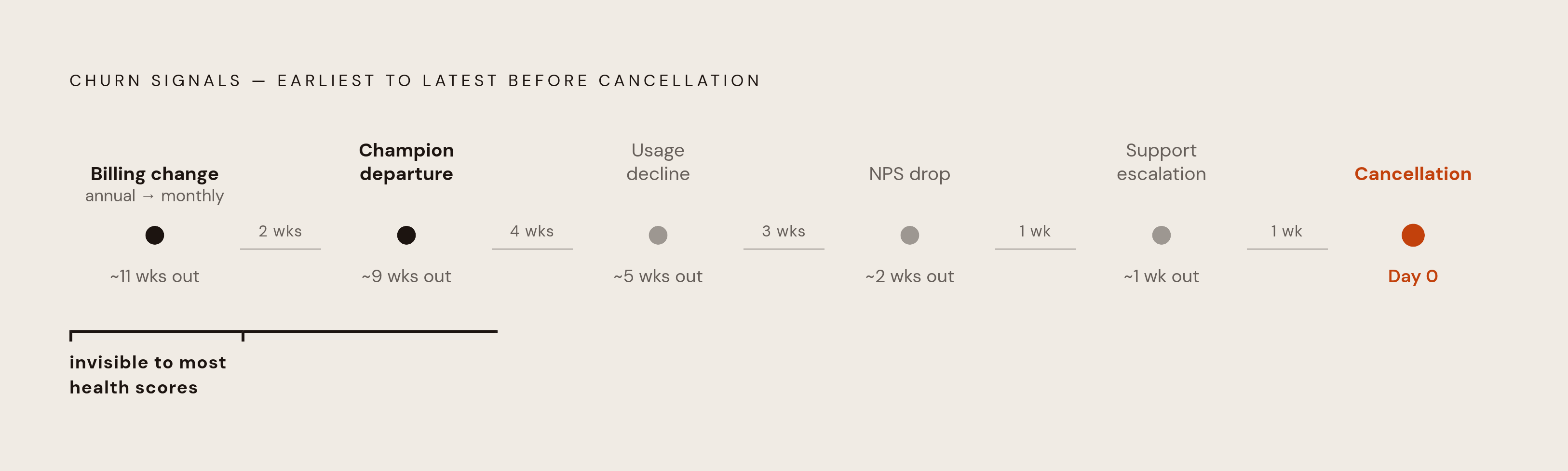
The fourth category is billing behavior, and it's the one most health scores miss entirely. A customer switching from an annual contract to monthly billing is signaling reduced commitment, and it's a strong, fast-arriving signal, but it usually lives in a billing platform like Stripe or Chargebee rather than inside whatever tool tracks product usage. Billing changes and champion departures tend to appear earliest, usage decline sits in the middle of the timeline, and NPS drops or support escalations tend to appear latest, closer to the point where the decision is already made. Building a real early-warning system means knowing which stage each signal belongs to, not collecting all of them into one score.
Why Health Scores Surface Risk Too Late
The obvious objection to all of this is that most CS teams already have a health score, so this problem is supposedly solved. Gainsight's 2025 Customer Success Benchmark found that most SaaS companies still rely on manual or semi-manual health assessments. Automated scoring hasn't replaced human judgment in day-to-day operations the way the pitch for these tools suggests. Telemetry can tell a team what an account did. It can't tell them why, and why is where churn actually starts: a champion left, a sponsor lost an internal budget fight, the product solved a problem the customer no longer has. Most health scores are built almost entirely from product analytics. They miss billing signals sitting in Stripe or Chargebee, relationship signals sitting in CRM contact history, and friction signals sitting in support ticket patterns over time.
A 2026 study found that a large share of customers who eventually churn show measurable warning signs well before they cancel, yet most health scores still catch that risk too late for a team to run any meaningful intervention. The data existed. It just wasn't in the score. And the common answer to this, that AI-driven scoring will close the gap automatically, deserves some skepticism. Hex's analysis of self-serve analytics tools describes a familiar pattern: the pitch promises full democratized access, expectations get set around high adoption, and actual usage lands far below both. The same gap appears when AI scoring gets bolted onto a CS platform that was never built to ingest billing or relationship data in the first place.
None of this means health scores are a lost cause. It means they're incomplete by construction. Planhat's five root causes of churn, value never reached, a single-threaded relationship, value delivered but never demonstrated, business change, and accumulated friction, each leave their traces in a different system, and a score built from product telemetry alone will miss at least three of the five. A score worth trusting has to pull from usage data, billing data, relationship data, and support data at once, which is a harder build than most teams have attempted, and is the gap the next section's framework is meant to close.
A practical framework for pairing leading and lagging metrics by team role and time horizon
The right pairing of metrics depends on two things: who's looking at the dashboard, and how far ahead they need to see. A CSM deciding whether to call an account today needs a different view than a CS leader setting priorities for the week, who in turn needs a different view than an executive reporting growth numbers to the board once a month. The governing rule is simple: every lagging metric should be paired with at least one leading indicator that gives enough lead time to act before the lagging number locks in.
Churn rate, the lagging side, pairs with usage trend, the DAU/MAU stickiness ratio, and billing plan changes on the leading side. NRR pairs with expansion conversation rate, champion engagement, and license utilization growth. Renewal rate pairs with QBR completion rate, product adoption rate, and sentiment trend. Each pairing gives a team a way to see the outcome metric coming before it arrives, instead of discovering it after the fact.
For a CSM working a book of accounts day to day, the dashboard should lean almost entirely on leading indicators. That means watching usage trend account by account, where two weeks of decline is treated as a trigger to act, not a data point to note. It means tracking contact activity, specifically when the champion at each account last logged in or responded to an email, since silence from that one person is often the earliest signal available. It means watching open support tickets by age, since accumulated friction is visible there well before it ever appears in a CSAT score. Sybill's CSM dashboard model backs this up directly, recommending a daily view organized around health score movement, engagement signals, and at-risk account flags, not around aggregate churn numbers that say nothing about any single account.
For CS leadership operating on a weekly cycle, the view needs to mix both sides. That means watching health score distribution across the whole portfolio, tracking how many accounts slid from green to yellow or yellow to red over the past week, alongside a maintained list of at-risk accounts with an intervention plan and an owner assigned to each one. It also means separating voluntary churn from involuntary churn in the weekly trend, since a customer who chose to leave and a customer whose payment failed need entirely different responses, and lumping them together hides which problem a team is actually solving.
For executives reporting on a monthly or quarterly rhythm, lagging metrics rightly take the lead: NRR, gross revenue retention, renewal rate, the numbers a board actually wants. But even at that level, pairing each one with a one-line leading indicator, a stickiness trend, a champion engagement rate, a QBR completion rate, turns a report that only confirms what already happened into one that also signals what's coming next quarter. The metric that satisfies the board and the metric that gives a CSM time to act were never in conflict. They just needed to be reported side by side instead of substituted for each other.